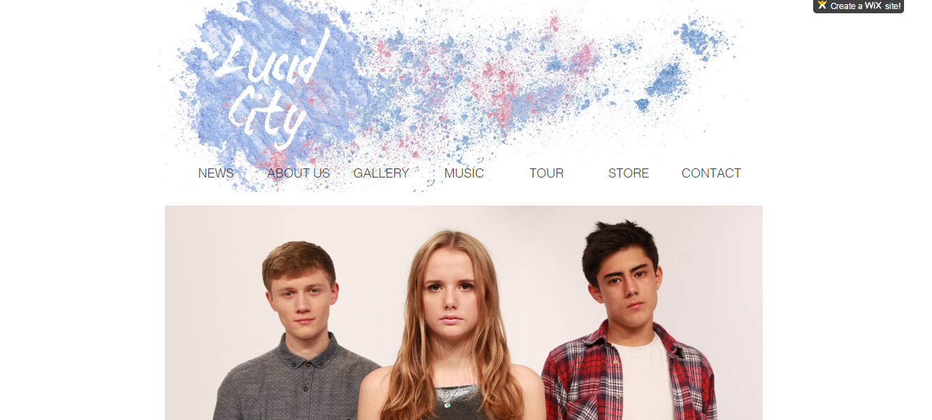
Our Music Video

Our Band Website

Our Band Website
Click on the image to get to the website

Our Album Digipak- Back and Front

Our Album Digipak- Back and Front

Our Album Digipak- Middle

Our Album Digipak- Middle

Friday 19 December 2014

Revising the Album Cover

Changes 

Colours

In order to make the colour scheme more distinct we decided to have one colour of power paint on the title and spine instead of mixed.We made sure these were the same shades of blue and pink as the website.


Back Cover

We added a QR code, made using a QR code generator, in which you type in the website url to get the image.  
We also added copyright information in small text underneath and a link to the Twitter page to create synergy and encourage the use of social media.


Editing Feedback

Test Edit

Once we had all our footage in place, edited to the music and had improved on previous feedback, our final (test) edit was ready to be reviewed.


Feedback


  • 1:48-1:54 Too much going on, too many overlays 


We decided to take the second layer of video off these close up shots.


  •  Introduction to forest scenes (1:05-1:11) could be made clearer. 

In order to establish the introduction of the powder paint scene in the forest, we decided to overlay archive footage from Alice in Wonderland (1951, film) where she enters the forest, over this shot as done before with the rabit hole sequence. 


Website Interactivity

It is important that the website encourages audience involvement with the band, is informative and provides purchasing opportunities. When improving the website these were the key things we focused on.

Competitions


Competitions are a good way to involve the fans and give them something back. We thought a festival inspired competition would be good for our target audience. The competition we created required fans to send in their best festival pictures, to have the chance of winning two free vip tickets to Lovebox festival (a day festival in London targeted at 16-24's). There will be a photo archive of everyone's submitted photos, encouraging fans to interact with each other. Our competition is advertised on the home page. 


"Membership"


There are gadgets in the Wix App Market that offered opportunities for audiences to sign up for updates. 


Purchasing Opportunities 


It is conventional for the website of an artist to work to promote and sell their latest album. This was something that we had not yet incorporated into our website. We worked to integrate this into our Home and Music pages.  

Music page


Tuesday 16 December 2014

Target Audience Feedback

Reaching the end of our project, we showed our edit to a member of the target audience- Izzie, a 17 year old, interested in many genres of music including dance, and regular festival go-er, to see if there was anything we could add to improve our video and to see the response.

It was reassuring to hear that the use of colours was something that Izzie mentioned was good and memorable.

Impovements to be made- more focus on ending, making it clearer.

I also showed her the Website and Album Cover...

Website

"The layout made things easy to find, especially tour dates."

"Behind the scenes pictures and "about us" was a good insight into the band members."

Album Cover

"reflects the song"
"looks clean neat simple, and not tacky"

The full interview is below:


Sunday 14 December 2014

Editing feedback

We screened our edit to Gavin, fellow media peer, to hear his views from both a member of the target audience and a technical "media student" perspective

Merchandise

Upon doing some research into other artists targeted at the young adult age group (from 17-24) unisex but prominently female, I found other than the standard T-shirt and CD, some niche items such as beanies and iphone cases.

T-Shirt


The splattered powder paint on our white t-shirts after filming the paint fight inspired us when creating our artist t-shirts.

t-shirt after powder paint fight


Baseball shirt option


We decided to have an alternative to the plain short sleeved t-shirt, I noticed this on the Ellie Goulding website, which is targeted at a similar audience to our artist. The baseball style shirt is popular at the moment and has a large appeal to a tom boy audience. Here we also continued with the powder paint theme, but without the splatters all over as that would look too busy. 


Record 


Beanie


We thought this would be nice for our audience as it is unisex, however we have also made a pink option because some girls might want a more girly one.


Iphone Case


Iphones are immensely popular within the age group we have targeted at, therefore we have put our splattered paint branding onto an iphone design. 


Poster


Editing

middle section (01:48-02:04)


This is the section where the song reaches a crescendo, increasing its pace, to a climax in which it slows down completely. We planned to have our neon section here, switching between neon and normal for the different lyrics "hey" and "heart beat moving" and then to slo mo pinata exploding. However since we made the decision to axe the neon scene, we had to play around with out footage to try and find an alternative.

One option we tried was to fade to black between performance and balloon scenes.

To do this we added a key frame and lowered the opacity:


This is a brief section of what it looked like:

(0:06-0:11)


We were not satisfied with this effect, and continued to explore alternatives


Grading

As highlighted in the feed back given to us after viewing a rough edit, there is a significant difference in the aesthetic of the scenes filmed in the studio (balloon and performance) with the forest scene that is filmed out doors, due to the lighting that the control of the studio allowed us. Therefore the grading would be vital to try and reduce this gap.

This meant using the Procamp and Three Way Colour Wheel tools to try and bring out the colours of the paint fight.

.

Album Cover

Front


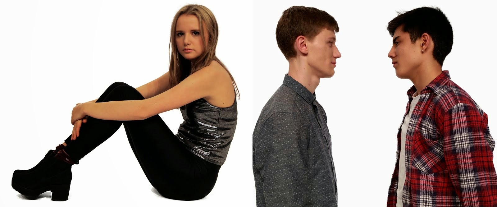
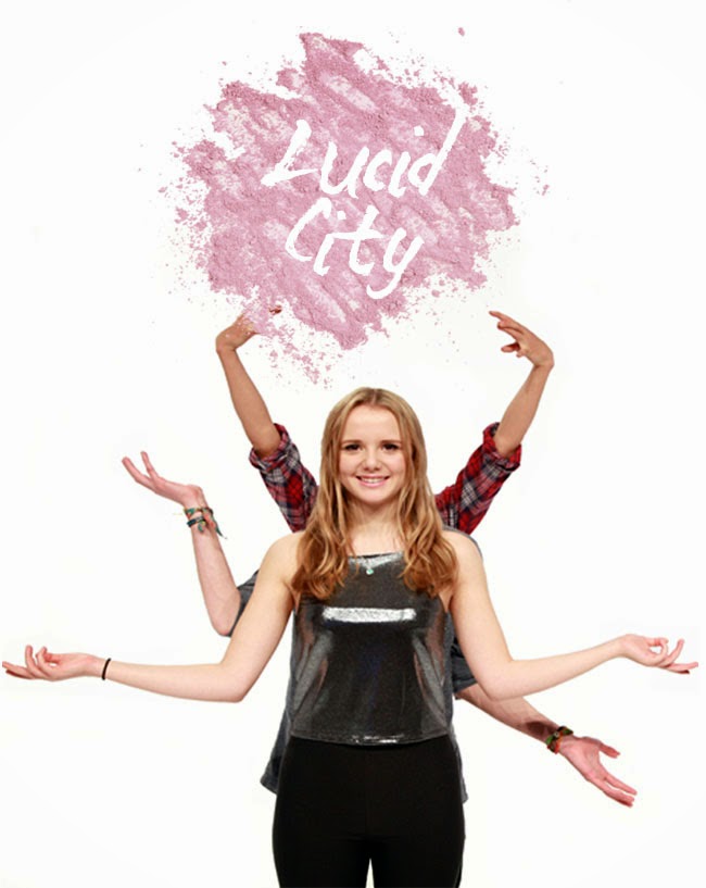
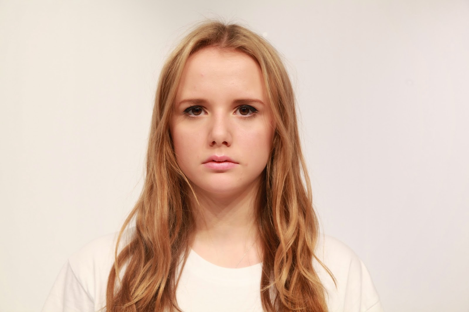
The focal image was created by layering two images on top of each other at slightly different places and lowering the opacity, creating a blurred effect. The image is composed with Georgie in the middle and the two boys on either side, which works to establish her as the singer. 

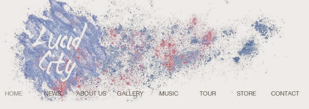
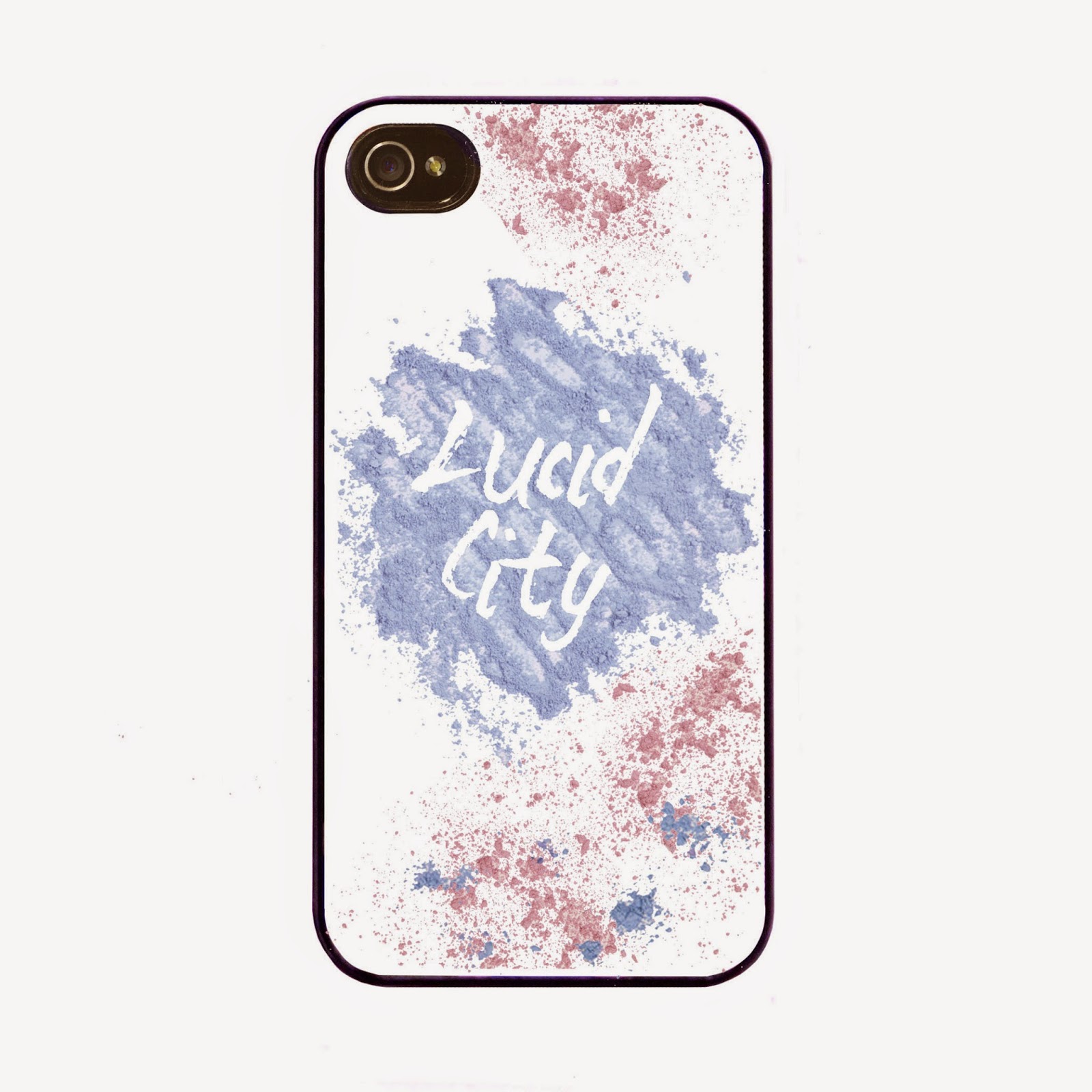
The album is self titled therefore the main text on the cover is the artist name. This is in the same font as the website, however we decided to use the powder paint differently- reversing it so that the font itself is made up of paint, as this worked better with the composition of the cover.


Although we were aiming to achieve a minimal aesthetic when creating this cover, when receiving feedback from peers it was suggested to add a texture to give it more depth. We experimented with overlaying images of lighting from live performances as this tied in with our genre nicely:


Feedback from 16 year old male "looks a bit david bowie wouldn't buy"


"I like the image of the artist but the font does not compliment it well" - from same person as above

However we concluded that the initial plain duplicated effect was enough and when speaking with member of our target audience (as opposed to peers) they confirmed this decision saying it was they preference.

Back

Continuing with our running theme of powder paint, we decided we wanted to have powder paint smudges with the track titles on top. After discussing with Chris (the technician) we decided instead of taking photos of powder paint we could download a "smudge" tool for Photoshop off the internet. These came in a variety of smudges that you could re size to get the shape you wanted. 

Inspired by the simplicity of Disclosure's album we decided to align out track titles in the center furthermore it corresponded nicely with the front cover which is also aligned through the middle.


aligned in the center

It is important that both the album cover and website used the same fonts to create a clear branding. These fonts we decided on were"Mad Zombies" for the artist name and "Arial" for the body text. I found these fonts complimented each other well with "Arial" being simpler and easy to read and "Mad Zombies" more exciting and interesting. 

example text from website- same fonts on album cover


Production company logo

It is conventional for the back of the album cover to feature production company logos. Our production company is called Technicity, a branch off Universal, that specialises in the dance music genre. When creating their logo I took this genre into consideration being the main inspiration behind decision of font and image.

Middle 

The CD will be covering the right side therefore we decided to place the boys here as they are positioned on opposite sides leaving space in the middle for the CD. This also continues to establish Georgie's role as singer and front woman, as she is placed separately on her own page.

The composition of the photographs, in particular Eugene and Gavin, continues to follow the theme of aligning in the middle as shown on the front and back cover. 


Editing- Narrative Change

Opening Sequence

When story boarding and making our animatic we planned for the opening scene to show Georgie (protagonist) walking through a field and finding a tunnel which she enters and leads her too the white room and the cupcake. On editing we soon realised there was not enough time for all of this to happen and since we were no longer shooting the powder paint fight in the forest with the tunnel we decided to axe this scene.

Neon scenes

We originally wanted some close up performance shots of Georgie in neon. We soon discovered the complications this brought about and we did not have enough black light equipment to do so. Therefore a good alternative was to invert the shot in editing to create a similar effect. We played around with this and the results were as follows...


Although it created a neon effect that with the right make up could look like glow in the dark paint, we decided not to put this in.

Revising the website

Evolution of the website:

First


Second

The main difference here being the new banner.


second

Third (and final)

We found that a significant improvement was made when chosing a clear theme and font that ran across all the pages.


This grey, block theme is continued across all pages, for example the tour...


Branding- Logo for Website Banner and Album Cover

Font

Originally when researching album covers I thought the font- helvetica neue bold, as used by majestic causual, a brand that specializes in the electronic music, deep house, experimental, hip-hop, indie, pop genres would be a good font to use for our brand as I think it could represents the genre of our artist- dance pop, well. 


However we found that this looked bland against our images of powder paint that we also wanted to use. Furthermore when conducting audience research between helvetica neue bold and "mad zombies" we found that "mad zombies" was more popular.


Colour

We created the logo by making patterns with the powder paint (the same as we used on our shoot), then taking photos and editing them. Our first banner was the original colour of the purple powder paint we used however we wanted to make it blue as this would give it an appeal to both male and female audiences. We did this by altering the Hue on Photoshop. 


First


hue

Second
When asking peers we received a better response with the blue from both boys and girls, showing that was the best decision in order to appeal to our prime and secondary audience.

25/11/15- Back Up Shoot

This studio session was for shots that we missed from previous shoots that after reviewing the footage in editing thought were necessary. We also took this as an opportunity to take out album cover and promotional shots.

CU balloon scenes with Kayvon, Josh and Matt

In order to have a wider variety of shots to make the video more interesting we thought we should get some close ups from the balloon scene as previously we only got long shots and shots with the dolly. 


Finishing shot

We also needed to shoot the final shot for the video- Georgie "waking up"/ returning to reality.


Album and promotional pictures

Album Cover

For the album cover we had an idea to have Georgie front on, facing the camera with Gavin and Eugene on either side looking the opposite way. For this we wanted them to be in white T-shirts so that when we overlayed them, it would not look strange.


90 degrees

45 degrees

front on


Promotional Pictures

Previously we had taken photos after various set ups from the music video, but it was important to get some promotional shots for the website. For this we styled the boys in shirts for a smart/casual look, which Georgie's styling also reciprocated, with a metalic crop top, leggings and heeled boots. We took a variety of shots, individual and together with both fun and serious poses. 


Wednesday 3 December 2014

Performance Scene Rehearsal/ Screen Test

The purpose of this performance rehearsal was for us to see Georgie in front of camera in the role of the lead singer and to help her feel more confident with her performance and lip sync before the shoot.


After this we felt confident in our choice of Georgie as our lead performer and she felt more prepared for the filming of performance scenes.

Tuesday 2 December 2014

Performance scenes

11/11/14 (DJ Shots)


Actors: DJs

This was our first shoot for the performance scene and featured just the DJs. As this was our first time setting up for this scene we soon discovered that it would take longer then anticipated. The main time consumer was the lighting, it took a lot of fiddling about with in order to achieve the look we wanted- for the DJs to be in blue and Georgie in pink, without the actors being too dark and fading into the background. Although we had done this previously with us standing in for the DJs we are different heights to them and when we brought their decks in the composition changed. We ended up using the back lights to light them. We also had to light the playing cards individually as they hung at different levels. 

us setting up the playing cards for the shoot

However once issues with the set were over the shoot flowed smoothly, we played music which our actors reacted well to with high energy and movement. We even got around to using the glide cam, to get movement shots that are typical of music videos. 


me using the glide cam

14/11/14 (DJ and Georgie shots)

periods 2&3- DJ's

periods 4&5- Georgie

For this shoot we came in early to set up as we did not want a repeat of last time and wanted to maximise the time we had with our actors for filming. First we shot the DJ's which I think was more successful then previously as we had a clearer idea of what we wanted and our actors were more comfortable with their roles.

After break we shot Georgie for the first time. Her make up took about 10 minutes to do but we suspected this. The first take was not her strongest performance but she soon got into role and responded well to the feedback we gave her e.g. to enunciate the lyrics more. For this shoot we were just filming "beauty shots"another typicality of music videos, and mid close as we did not have the DJ's in the background, therefore a strong lip sync is key. We were very happy with our footage. 

16/11/14 (All of the Group) 


7:30am- 12pm

This was our Saturday shoot with all artist members and their first time to perform as a group. It was good that they all had previous experience as I think practice made them more comfortable and confident with their roles which showed in this scene.

We finished shooting early and got time to get some promotional shots.  

us on set


Sunday 23 November 2014

Powder Paint Fight

20/11/14


For this shoot we decided to film at lunch from 12:30-1:30, this was not ideal as it did not give us much time but it was the only time we could get the artist, actors and crew together. Even with this time slot we still found that there was one artist member that could not attend however due to lack of shooting time we decided we should shoot anyway and then do another shoot on the following Monday.

Equipment- 550 digital camera and Go Pro

all of crew on the set of the paint fight

Reflections


Positives

- When watching the footage back we were pleased with how the powder paint looks on camera and the choice of colours. Furthermore it was a prop that the actors could interact with playfully connoting the joyous festival feeling we were trying to create.
- We attached the go pro to a cast member and found it worked well in immersing the viewer in the paint fight.

Negatives and improvements for the next shoot

- To try and get a range of shots such as more camera movement where the camera follows the actors and natural close ups.

24/11/14


I felt that this shoot went better then previously as we organised time better and managed to get a wider variety of shots.

For this shoot Ellie, Masie and I all performed as extras, as a reflection from the balloon scene we realised it would be easier to use crew members as it is harder to organise time slots for more actors.

Online- Website and Social Media


Social Media Links


We tried to use the same user name- lucid_city_ as much as possible in order to create a sense on branding and familiarization for the audience
Instagram

http://instagram.com/lucid_city_

Twitter

https://twitter.com/lucid_city_

Sound Cloud

Sound cloud is a social media platform entirely based around users uploading, liking and sharing music. It works on a tagging system where users can listen to loads of songs under the same genre. It is great for discovering new music and it is used by artists under mainstream management from artists under independent institutions or no management at all.  For these reasons we thought it would be an essential platform for our artist.

https://soundcloud.com/lucidcity-1


17/11/14- Balloon Scene

For this shoot we had the studio from 3:45- 9 pm and wanted to get all the shots done for this scene, as it would be hard to find another date with all the same actors. This shoot had the biggest cast which made it quite a different experience to our previous shoots. For this scene we wanted really energetic dancing, and in order to get this we had to make a comfortable environment for our actors who are not professional dancers. For this we played music they liked and communicated specifically what we wanted with them. 


It was important that the lights were switched off as often as possible in order to prevent the balloons from popping therefore we split up the tasks to sound and light, camera, director and music/props (turning the music on and throwing balloons at actors) and altered between these roles. This photo was taken by Ellie while she was in sound and light and Maisie, Molly and I did camera and directing. 

Reflections

Positive
Splitting up the roles was a good way to organise it however it was often hard for us to communicate with each other and the actors over the music.
Our actors got into the mood of the scene and we got good footage of them dancing which is what we wanted.

Negative
It felt like quite a chaotic shoot with lots of actors to organise and we ended up not following the shoot board we had planned, therefore we are missing quite a few close ups.

First shoot 6/11/14 - White Scenes

This was our first shoot in which we filmed the opening sequence- the white room set up, where Georgie, the protagonist, enters a room, sees a cup cake on the table and eats it. 

filming the close up of the cupcake


After the shoot I felt really positive about it however on watching the footage back and putting it into our sequence we realised that the jump in framing between the shots from long to close up made it hard to follow. This was because when making our shoot board we did not visualise the scene to the detail of specified camera angles and some of the framing.

Thursday 13 November 2014

Location Recee

Originally we planned to shoot our powder paint fight in Epping Forest. This required finding a date that all members of our artist group could do and organise 7 extras. The only date everyone could do was Saturday 22nd, leaving no time for a re shoot and carrying all our powder paint to the forest which would have been very unpractical and risky. An alternative option was to film in the rec a couple minutes away from our school, we originally dismissed this idea as it is mainly a field with goal posts. However there is a small woodland area that we thought with tight framing could look like a forest. We did a test shoot to see how it looked:


We decided that this would work and plan to shoot next Thursday ( Thursday 20th). Another benefit of filming close to school is that it allows us to have a bit more control over the weather as we can retreat back to school if it starts raining, which is likely at this time of year.

Tuesday 4 November 2014

Shoot-Board,Shoot Schedule and Call List

Part of the planning process is to create the shoot board, shoot schedule and call list, which helps get organized for shooting- getting props, actors, location, equipment together.

Shoot Board


In order to create this we looked at our animatic and transferred each shot into the shoot board, organizing them by scene.
Here's an example from the balloon scene of the detail we put into the shoot board...


We did this for every scene and every shot. 

Shoot Schedule


We then used this to make the shoot schedule. When doing this you think of the most efficient way of shooting each scene by looking at the practicalities, which is usually not filming in the chronilogical order shoots appear on screen. For example for the balloon scene for which we had a large cast as well as the three artist members, we organised it so that we did all the group shots first and then the shots that included artist members only. This meant the group of extras could leave early and wont be hanging around waiting to film. It is also a very useful at giving you a rough idea of the timings of your shoot.

Colour code:
Blue- when not filming


Call Sheet


The call sheet is a simplified version of the shoot schedule that lets actors and crew know when they are needed for make up, costume and shooting.

This is the accompanying call sheet for the shoot schedule above.